Case study · B2C SaaS
An onboarding redesign focused on conversion & activation.
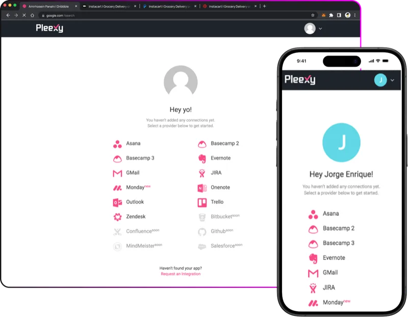
Pleexy connects task managers like Todoist and Asana with tools like Notion and Trello. Most users were signing up — and then disappearing before they ever connected one.
At a glance.
Three months of research, validation, and iteration moved the numbers that matter.
Activation
17% of new sign-ups were finishing setup. After the redesign, 78% of them did.
Conversion
Conversion moved from 9% to 21% in the three months after launch.
Support load
Setup-related tickets dropped sharply once the wizard handled the moments that used to break.
About the project.
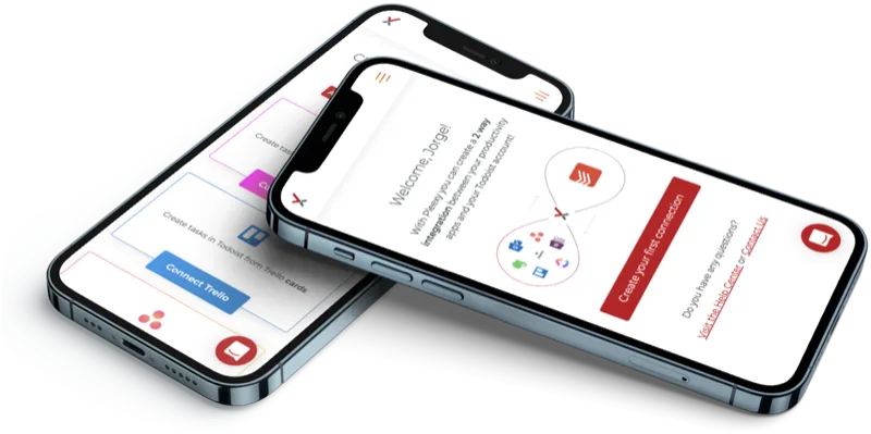
Pleexy transforms scattered tasks into organized action by connecting your task manager with tools like Notion, OneNote, Trello, and a dozen more. The product worked. The first session didn't.
The brief: improve first-session activation with a value-first, low-friction onboarding — without sacrificing the configuration flexibility power users depended on.
Context.
Role & team
- Product Designer (end-to-end)
- Working with PM, 2 engineers, QA
- 3-month timeline: research → validation → implementation → tracking
- Web app and mobile responsive
Users & constraints
- Busy professionals adopting multi-tool workflows
- OAuth scopes across multiple third-party providers
- Provider-side rate limits
- Legacy mapping logic we couldn't break
A broken onboarding flow.
Out of every 100 sign-ups, only 17 connected a single integration. Most never reached the moment Pleexy delivers value.
The original flow asked too many decisions up-front, hid the value behind configuration, and broke on smaller screens. Sessions ended before users connected a single provider.
The research goal was simple: why didn't users set up an integration?

Combining data with user feedback.
Four parallel lenses on the same question. The friction wasn't in one place — it was in how the steps stacked.
01 — Heuristics
Heuristic review
Audited the flow on desktop and mobile. Unclear hierarchy, competing CTAs, and configuration-first patterns surfaced fast.
02 — Analytics
Product analytics
Tracked sign-up → integration setup → conversion. The biggest drop happened before integration setup — value was unclear, guidance was missing.
03 — Interviews
User interviews
Sat with first-time users. Most weren't sure what was supposed to happen after creating an account.
04 — Support
Support audit
Categorised tickets. A large share traced to setup confusion, system failures, and ambiguous terminology.
users interviewed across three profiles: current customers, drop-offs, and unfamiliar task-manager users.
iterations of the Figma prototype before the new flow felt right to the people who'd been losing the old one.
Iterating with a Figma prototype.
While engineering tackled browser-compatibility fixes in parallel, I built the new onboarding in Figma and ran it past three user profiles — three from each, nine in total: current customers, drop-offs, and task-manager users unfamiliar with Pleexy.
Their feedback shaped multiple iterations. By the time we shipped, the flow had already been validated by the people we'd been losing.

What changed.
A handful of decisions — not a redesign of the product. The product was right. The first session wasn't.
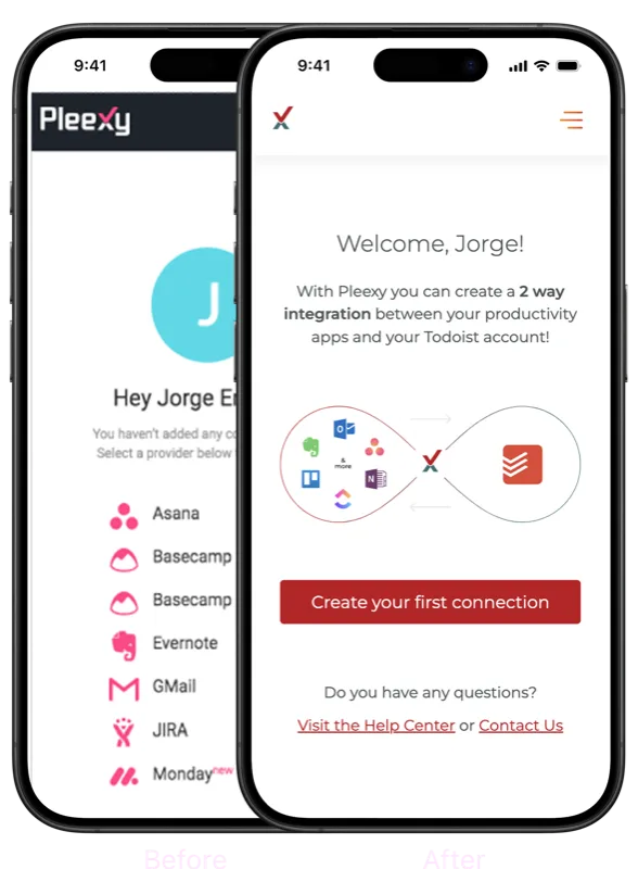
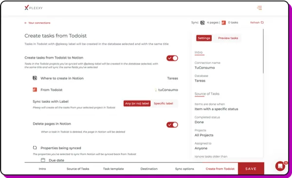
Wizard, not form
Broke configuration into stepped decisions. Users always knew what was happening and what came next.
Mobile-first
Most first-time users arrived on mobile. The new flow was designed for the small screen first.
Human centered language
Renaming the core concept to a human word. Users preferred it in interviews — repeatedly.
One clear CTA
"Create your first connection." Replaced competing buttons with a single instruction users could act on.
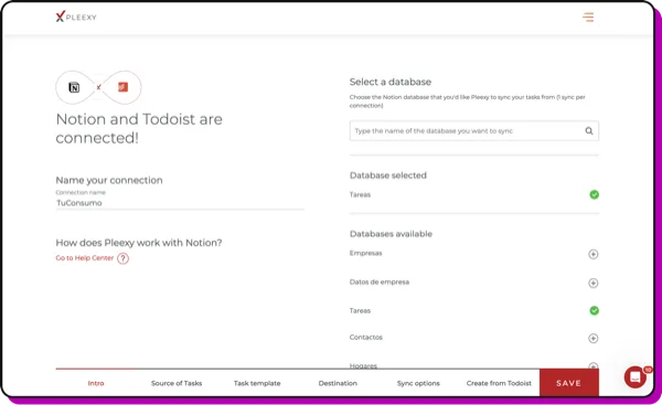
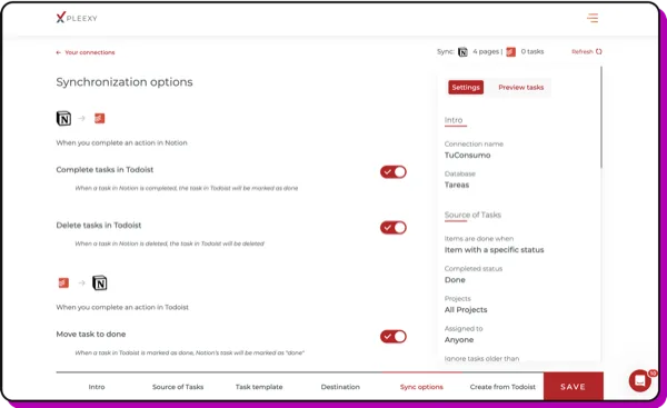
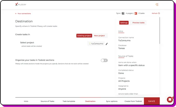
The new wizard.
Each step does one thing. Each step makes the next one obvious.
Before and after.
Three months of monitoring after launch. The funnel shifted in the same direction at every step.
Before
- 9% trial → paid conversion
- 17% completed onboarding
- One long form, configuration-first
- High support volume on setup confusion
After
- 21% trial → paid conversion
- 78% completed onboarding
- Stepped wizard, value-first
- 47% drop in setup-related tickets

Setup in seconds. No credit card for the free trial. Worked first time. This is exactly how integrations should work.Customer review · Trustpilot 4.5/5
What I took away.
Small friction kills activation
Unclear CTAs and broken mobile rendering aren't polish issues — they're the difference between a 17% and a 78% completion rate.
Onboarding is a growth lever
Listening to users, leaning on analytics, and iterating quickly turned the worst step in the funnel into one of the strongest.